I use Oracle Data Integrator for quite a bit of ETL work. Most of it tends to be with Oracle databases, but also a fair bit with MySQL, SQL Server, and others. A common integration is to update data in a table based on a primary key, and insert new data if existing data doesn’t exist.
It’s also common to insert a sequence value into a row that you populate in a table somewhere. Sequences in Oracle are this mechanism where you basically ask them “Hey, give me the number in something we’re counting!” and then plug that value in. They are commonly used to generate unique values for rows that get inserted somewhere.
Sequences aren’t random numbers – they start off at 1 (or whatever you configure them to) and then count up, and up, and up. Like up to the number 999999999999999999999999999 (that’s huge!). In fact, there’s so many possible sequence values that if you happen to use a few by mistake, it’s not that big of deal. Just use a new sequence value! It’s not uncommon to see gaps in a table or rows that have a sequence value – this just happens due to the way data is processed and how the Oracle server will return blocks of sequences to be used in a given operation, then discard any that don’t get used (this might seem wasteful, but it’s not).
In any case, I was alerted to something interesting in a client’s ETL job awhile ago: sequence values in a table being updated by ODI were starting to seem abnormally large. In other words, this table generally has about 100,000 rows in it, and they are used to the sequence values being less than a hundred million or so. All of a sudden the sequence values were trending much higher.
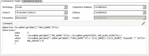
It turns out that the job in question uses the MERGE Oracle IKM to update rows. This is a strategy where existing rows (identified by a particular primary key) are updated based on the primary key, and new rows are inserted. MERGE is kind of an elegant way of writing this without having to have separate UPDATE and INSERT step. In fact, MERGE is thought of as an “upsert” due to being a combination of the two.
Under the hood, it seems that Oracle rewrites MERGE queries into something resembling two separate steps. And the way that Oracle rewrites the query is such that it burns or otherwise needs to use a sequence value for every row in the table, on every run. So if there are 100,000 rows in the table, about 100,000 sequences are getting used on each run, even if only one row is being updated. Couple this with the fact that the job runs hourly and almost always processes data, and you have a recipe for sequence values to go up pretty fast.
Of course, we could literally burn one trillion sequence values on every run of the job, and schedule the job to run a trillion times a day, and still not have to worry about running out of sequence values. But it does seem kind of wasteful.
For this reason, you might want to use one of the other Oracle Incremental Update IKMs, such as the traditional INSERT/UPDATE.
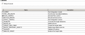
Late note: I wrote all this up and it seems that the IKM was modified to strip out a clause from the MERGE statement that would prevent rows that already existed in the target from even being touched, thus reducing the amount of rows in the MERGE data set, and thus lowering the rate at which sequence values would get burned. So I think the stock MERGE IKM is still fine to use with sequences in the target. It’s still true that MERGE will use sequence values on non-updated rows, it’s just that ODI tries to be smart and reduce the update recordset to not include those in the first place.
